Sequoia User Interface Components
Overview
- The SEQUOIA UI consists of a Main Frame which hosts the default Layout including Panels, Toolbars and Menu bars.
- Additional Secondary Frames can be created by dragging and dropping Panels outside of the Main Frame, including on a secondary monitor.
Panels
- Panels encapsulate UI components with related functionality, for example the “Object Properties” Panel displays the properties of the selected object, the “Bookmarks” Panel contains controls and icons related to viewport navigation, and so on.
- Panels can be either docked or floating.
- A docked Panel can be floated to a separate independent Frame, or can be moved to be docked elsewhere within the SEQUOIA UI.
- Panels can be docked either next to existing elements of the UI, or within existing Panels as additional Tabs.
- A Tabbed Panel can show the controls of only one Panel in its one active Tab at any given time, but can contain any number of docked Panels as inactive Tabs.
- A Tabbed Panel will have only one
![[]>](../../_images/options_icon_gray.png) Options icon which will display the context menu associated with the active Tab.
Options icon which will display the context menu associated with the active Tab.- To access the context menu of an inactive Tab, you must make it the active Tab first.
- A Panel or the active Tab of a Tabbed Panel can be closed by clicking the
![[X]](../../_images/close_panel_icon.png) icon in its upper right corner.
icon in its upper right corner. - A new Panel can be created for the current Document via the Main Menu Bar > Panels menu.
Rollouts
- Rollouts encapsulate related controls into an entity that can be collapsed to save space, or expanded to adjust the control values.
- When collapsed, most Rollouts will reveal in their title bars significant information about the states of the contained controls.
- The guiding principles of this feature were:
- The current value of multi-choice controls (like drop-down lists) is always displayed, for example the Point Loader > Display > Color drop-down list.
- When an option is turned off by default, it is only displayed when turned on, for example the Mesher > Display > Use Lighting checkbutton.
- When a slider has a neutral default value, the value will only be displayed when changed from its default, for example the Point Loader > Display > Channel Scale value which is displayed when not equal to 1.0.
- When a color field is employed to signal an important status, the color will be propagated to the rollout background, for example the Point Loader’s Status field.
- As result, the titles of collapsed rollouts only provide relevant info and ommit disabled controls and neutral values.
- This lets the user see at a glance a lot of information with almost all rollouts collapsed, and only expand rollouts to modify values when needed.
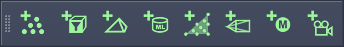
Toolbars
- Toolbars typically contain Icon Buttons and Icon Checkbuttons, but can also host various other controls including Text Buttons, Drop-down Lists, Value Sliders etc.
- Toolbars can be docked at the edges of the Main Frame - top, buttom, left and right.
- Multiple Toolbars can be docked together to be combined into strips of controls, or docked to different sides of the Main Frame to be kept separated.
- Right-Clicking any Toolbar provides a menu with checkboxes to toggle the visibility of all available Toolbars.
- Toolbar icons use large icon definitions in 32x32 pixels format.
Toolbar Controls
Icon Buttons
- Icon Buttons represent ActionItems - when clicked, a command will be executed that performs an action on the current document, object etc.
- For example, clicking the “New Point Loader” icon will create a new Point Loader object in the current document, clicking the “Zoom Extents” icon will zoom to the extents of the current selection etc.
- ActionItem Icon Buttons are colored - those that create new objects are green, those that perform other actions are blue.

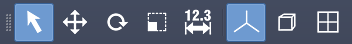
Icon Checkbuttons
- Icon Checkbuttons represent properties of the SEQUOIA system, of the Active Document, or the Active Viewport, and can be toggled on and off.
- When toggled on, they will have a blue background to signify an active state.
- For example, toggling the “Toggle Shaded/Wireframe Mesh Display” icon will switch the current view between Shaded and Wireframe display.
- The Checkbuttons’ Icons are always white.
Checkbutton Radio Sets
- Some Checkbuttons could be combined into Radio Button Sets to represent multiple possible modes where only one mode can be active at a time.
- For example, the Select,Move, Rotate, Scale and Measure icons represent the current Tool Mode - checking any of them unchecks the others automatically.
Menus
- Both the Main Menu Bar and the various Option and Context menus use ActionItems.
- An ActionItem consists of
- A Text description describing the ActionItem’s functionality,
- An optional icon on the left side, which can be shaded blue when the ActionItem is a checked option,
- A checkbox on the left side when the ActionItem is a checkable option and no icon has been specified, and
- An optional Keyboard Shortcut definition on the right side.
- Menu Icons use small icons in 16x16 format.

Button Control
- The Button control lets you perform an action by clicking with the mouse.
- For example the
![[Update Point Loader]](../../_images/button_update_point_loader.png) button causes a Point Loader to reload the data from disk, the
button causes a Point Loader to reload the data from disk, the ![[...]](../../_images/button_load_file1.png) button next to a File Textfield opens a File Dialog to pick a source file, and so on.
button next to a File Textfield opens a File Dialog to pick a source file, and so on. - No other features are currently associated with the Button control.
Checkbutton Control
- The Checkbutton control lets you toggle an option on and off.
- It displays a checkmark symbol followed by a text either describing the property it represents, or its state (Enabled/Disabled) when the property is listed next to the Checkbutton.
- The background color of the button will be highlighted (blue by default) when checked,
- The background color will be default gray when unchecked.


- When properties of multiple objects are represented by the same control and the states are different (undetermined), the background color will be shown in 50% highlight color and the checkmark will be semi-transparent.
Drop-Down List Control
- The Drop-Down List control offers multiple options to pick from.
- The currently active option is displayed in the control when not clicked.

- When clicked, a list of options expands, with the currently active one remaining highlighted.
- You can select a new option from the list to make it the active one.

Text Field Control
- The Text Field control provides an entry field for text data.
- A Text Field can be read-only for displaying non-editable data (e.g. Point Count), or editable (e.g. Object Name).
- The content of both read-only and editable fields can be copied from, but only the editable allow pasting into the field.

Value Field Control
- The Value Field control provides a text field accepting only numeric data.
- For example, the Position, Rotation and Scale fields of the Transform panel use such controls for their components.

Value Slider Control
- The Value Slider control combines a Value Entry Field and a Slider, allowing the faster adjustment of values within a pre-defined Range, and the visual representation of the current value relative to that Range.
- The Slider offers the following advanced features:
Slider Colors:
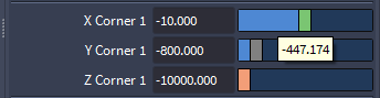
- The Handle of the Slider will be green when the current value matches the system default value of the property.
- The Handle of the Slider will be orange when the current value is outside the pre-defined Min. / Max. Range for the slider. The Entry Field can be used to set to out-of-range values by typing in.
- The Handle of the Slider will be gray when the current value does not match the above rules.
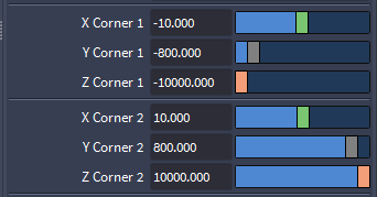
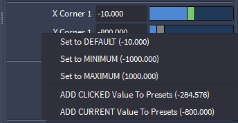
In the above screenshot, the two Corners of a default Point Region Of Interest with no valid point data input have default values of -10.0 and 10.0, and Min/Max Ranges from -1000.0 to 1000.0. Thus, Sliders with a value equal to the default have a green handle, Sliders with a different value than the default within the valid range have a gray handle, and Sliders with a value outside of the Min./Max. Range have an orange handle.
Slider Mouse Controls:
- Left-Click with the mouse on the Handle, hold and move left/right to adjust the value.
- Left-Click with the mouse to the left of the Handle to reduce the value by a computed step. The step depends on the current value - higher values produce larger steps, smaller values produce smaller steps. For example, a value of 100 will produce a step of 10, a value of 10 will produce a step of 1, a value of 0.1 will produce a step of 0.01 etc.
- Left-Click with the mouse to the right of the Handle to increase the value by a computed step. See above for details.
- Place the mouse pointer anywhere over the Slider without clicking, hold down CTRL and roll the Mouse Wheel to increase/decrease the value.
- Hold down CTRL and Left-Click with the mouse anywhere on the Slider to set the value to the clicked point directly without incrementing/decrementing.
- Hold down SHIFT and Left-Click with the mouse anywhere on the slider to snap to a round value based on a slider-specific step.
- Right-Click with the mouse anywhere on the Slider to open a context menu with the following options:
- Set to DEFAULT (X.Y) - sets the value to the factory default value. For example, for a Mesher’s Radius this value is 1.0, for Zhu/Bridson Blend Radius Scale the default value is 2.2 etc. These values have been determined by the developers of Sequoia as the most common and useful ones.
- Set to MINIMUM (X.Y) - sets the value to the Minimum Range of the Slider.
- Set to MAXIMUM (X.Y) - sets the value to the Maximum Range of the Slider.
- ADD CLICKED Value To Presets (X.Y) - adds the value under the mouse cursor at the time of the Right-Click to the list of preset values.
- ADD CURRENT Value To Presets (X.Y) - adds the value currently shown by the Field/Slider to the list of preset values.
- REMOVE Preset (X.Y) - if a preset was added and its value matches the current value displayed by the control, removes the value from the presets list.
- SET to X.Y - sets the value to the preset value created previously.
Slider Tooltip:
- As you move the mouse cursor over the surface of the Slider, the value under the mouse pointer will be displayed in a Tooltip.
- To set the slider to that value, hold CTRL and Left-Click with the mouse.
- To store the value as Preset, Right-Click with the mouse and select ADD CLICKED Value To Presets.